Blog

All thoughts and opinions in my blog are my own and do not represent the position of my employer.

CSS3 book launch event

In a few hours I’ll be speaking at the onlineĀ CSS3 Book Launch on “Real-world CSS3.” I’ll be talking about ways CSS3 can reduce your development times, decrease page loading times, improve usability, and increase the adaptability of your pages to different devices (including iPads, iPhones, and Android smart phones). I include a case study of a real site’s loading time and appearance before and after CSS3. I also talk in-depth about the example site from Stunning CSS3 that uses media queries to improve its appearance and usability at different screen sizes.

You can view the slides onĀ SlideShare, or download the slides here:

Real-world CSS3 (PDF, 2.3 mb)

Slides always make more sense with the person talking over them, so I hope you’ll register for the free event and come see me live! Jason Cranford Teague will also be speaking about a variety of cool CSS3 stuff related to his book CSS3 Visual Quickstart Guide. Finally, Peachpit is giving away a bunch of copies of our books. It’s a great chance to get your questions about CSS3 answered and possibly score a new book as well. It’s today from 3 pm to 5 pm Eastern time, but if you can’t make it then you can still register and watch the recording later.

Here are several links to related resources that I couldn’t put in the slides but which you might find useful.

Beginner CSS3 Articles

(more…)

Free samples of Stunning CSS3

Have you checked out the companion site for my new book Stunning CSS3: A Project-based Guide to the Latest in CSS? There’s a new addition there: two free sample PDFs with extensive excerpts from Chapter 2 and Chapter 6.

Chapter 2 is titled “Speech Bubbles” and it teaches you exactly that: how to make speech bubbles with pure CSS and no images. The excerpt covers word-wrap, generated content, border-radius, and HSLA/RGBA for semi-transparent backgrounds. The rest of the chapter covers linear-gradient, box-shadow, text-shadow, and transform.

Around the same time I was writing this chapter, Nicolas Gallagher posted an excellent demo on creating speech bubbles with CSS3 too, which I saw later. It’s definitely worth checking out as well. Great inspiration.

Chapter 6 is titled “Different Screen Size, Different Design” and teaches you how to restyle an entire page layout to work with different screen sizes using media queries and multi-columns. You can see the example site used in chapter 6, as well as other real web sites using responsive layouts, at my blog post “Examples of flexible layouts with CSS3 media queries.”

If these samples whet your appetite, you can also see a brief table of contents, images of some of the book’s pages, and links to related resources. And of course, if you’d like to buy the book, there are links to a number of sources in the sidebar of the Stunning CSS3 site.

Learn away!

Examples of flexible layouts with CSS3 media queries

In my CSS3 presentation that I’ve given several times over the past year, the part that seems to impress the audience the most is my demonstrations of media queries. I’m with them. I think media queries are perhaps the most useful and exciting piece of all the great new stuff that’s new to CSS3.

While creating effective, attractive, flexible layouts that adapt to the user’s screen size has always been possible, media queries add another layer on top of flexible layouts to make them even more adaptable to an even wider range of sizes, allowing you to really fine-tune the experience for even more users. Media queries allow you to selectively feed styles based on the characteristics of the user’s display or device, such as how much width is available in the viewport, whether it’s in portrait or landscape mode, or whether it can display color.

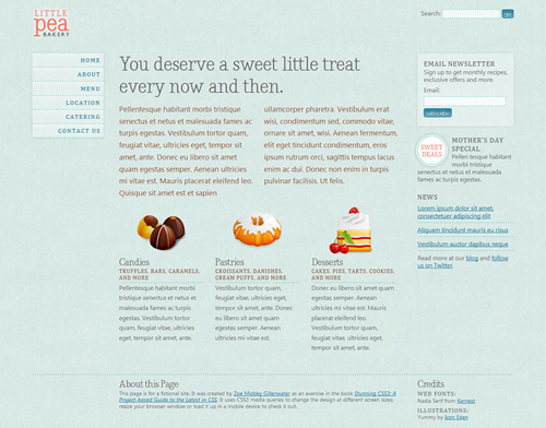
My demonstration of media queries is the fictional Little Pea Bakery site, created for my book Stunning CSS3: A Project-based Guide to the Latest in CSS. Here’s how it looks for most users (shown here at 990 pixels wide):

The "default" layout seen by most users.

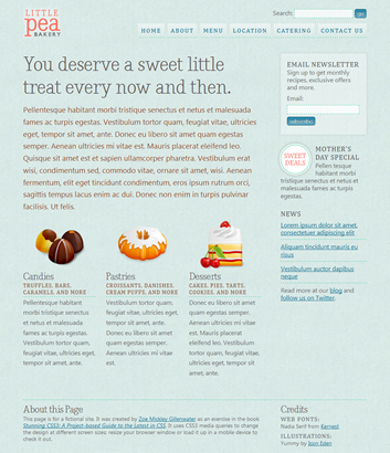
It’s a liquid (also known as fluid) layout so it can adapt to the user’s screen size, but the design doesn’t look as good and isn’t as readable when the viewport width is very narrow or very wide. I used media queries to solve this problem. Here’s how the page looks over 1200 pixels wide:

The layout for wide screens (over 1200 pixels) adds a third column.

(more…)

View more posts:

Archives by Category

  • Announcements (32)

    Learn what's happening in my career or industry, including information about my speaking engagements and books.

  • Articles (40)

    Informational or theoretical articles about a variety of web design topics, including CSS, HTML, accessibility, usability, and visual design.

  • Inspiration (8)

    Collections of images or links to others' design work that I find inspiring and think you will too.

  • Tutorials (5)

    Step-by-step articles that you can follow along with to learn a particular web design technique, including CSS layout and CSS3 effects.

Archives by Month