In my CSS3 presentation that I’ve given several times over the past year, the part that seems to impress the audience the most is my demonstrations of media queries. I’m with them. I think media queries are perhaps the most useful and exciting piece of all the great new stuff that’s new to CSS3.
While creating effective, attractive, flexible layouts that adapt to the user’s screen size has always been possible, media queries add another layer on top of flexible layouts to make them even more adaptable to an even wider range of sizes, allowing you to really fine-tune the experience for even more users. Media queries allow you to selectively feed styles based on the characteristics of the user’s display or device, such as how much width is available in the viewport, whether it’s in portrait or landscape mode, or whether it can display color.
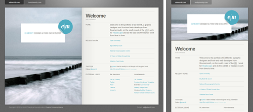
My demonstration of media queries is the fictional Little Pea Bakery site, created for my book Stunning CSS3: A Project-based Guide to the Latest in CSS. Here’s how it looks for most users (shown here at 990 pixels wide):
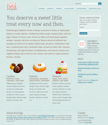
The "default" layout seen by most users.
It’s a liquid (also known as fluid) layout so it can adapt to the user’s screen size, but the design doesn’t look as good and isn’t as readable when the viewport width is very narrow or very wide. I used media queries to solve this problem. Here’s how the page looks over 1200 pixels wide:
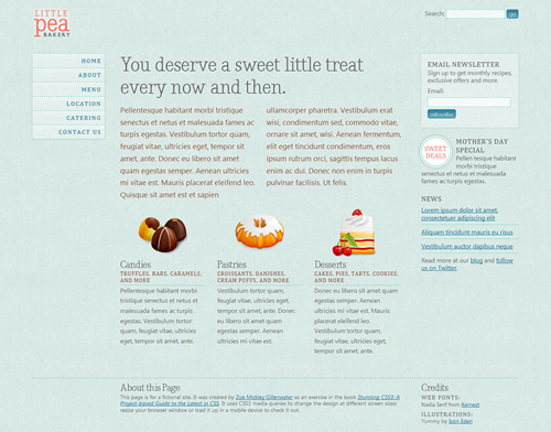
The layout for wide screens (over 1200 pixels) adds a third column.
Using a media query and just a few lines of CSS, I was able to easily turn the horizontal navigation bar into a vertical menu in a new third column. This kept the text line lengths from getting too long and making the overall design look too stretched out.
Going in the opposite direction, here’s what happens to the design under 760 pixels wide:
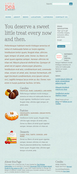
The layout for narrow screens.
We’re back to two columns, as in the “base” layout, but I’ve made changes to keep the content from appearing too squished and the line lengths getting too short. First, I got rid of the two columns in the introductory text. I also moved the three featured product boxes from sitting side-by-side to stacking on top of each other, moving the icon for each one from the top of the product box to the left side.
A third media query improves the design on small mobile screens, seen here at 480 pixels and 320 pixels:
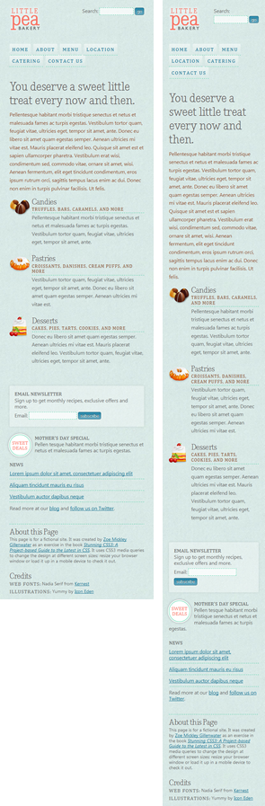
The layout for very small mobile screens uses only one column.
The design is now a single column. The main page heading and introductory text are smaller, as are the product icons.
To see all these changes in action, view the page yourself and resize the browser window. To see how it was done, check out the CSS embedded in the head of the page. You can learn the full details, of course, by reading Chapter 6 of Stunning CSS3.
For more examples of flexible layouts that use media queries to further enhance the site’s adaptability, dubbed “responsive web design” by Ethan Marcotte, see the following sites. Small screenshots don’t do them justice, so be sure to click through to the sites and resize your browser window back and forth to get the full effect.
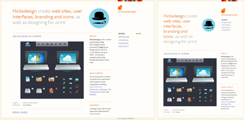
- Hicksdesign
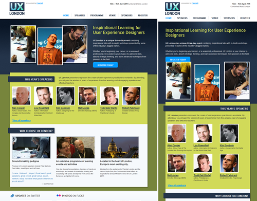
- UX London
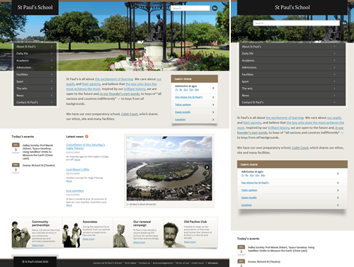
- St. PaulŌĆÖs School
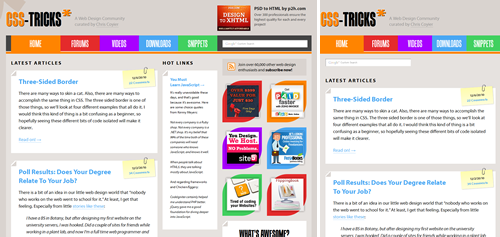
- CSS-Tricks
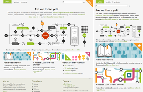
- Yiibu
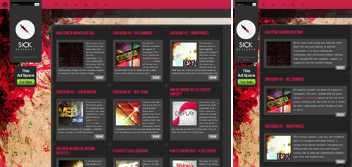
- Sick Designer
- Ethan Marcotte
- SimpleBits
- Science Hack Day
- Salter Cane
- Huffduffer
- Adactio
- mindgarden
- dConstruct 2010
- edgeofmyseat.com
- Daniel T Ott
All of these sites use liquid layouts, but that’s not a requirement for using media queries. It’s also possible to use media queries to essentially create multiple fixed-width layouts that can be switched between on the fly. A few sites that do this are:
Know of any other great uses of media queries in the wild? Please share them in the comments!
Update 1/25/11:
I’ve learned about a few other resources for media queries/responsive layout inspiration:
- Media Queries gallery
- Web round up #11: The best responsive web design examples and resources
- Responsive Web Design: What It Is and How To Use It
Also, I’m bookmarking sites that I find to be nice examples of media queries on Delicious.


I vote Andy Taylor’s CSSgrid (cssgrid.net) to be added Zomigi. It’s most-impressive.
Yes, cssgrid.net looks cool! This blog post is older than it is, which is why it’s not in the list.
Oops, strike my previous comment. I wasn’t paying close attention and thought you were commenting on a different, older post on my site! Sorry about that! Yes, cssgrid.net uses media queries itself in addition to providing CSS for you to implement media queries on your own sites, similar to the Less Framework.
Thanks a lot Zoe. That is a great piece of information.
That looks interesting, too:
http://lessframework.com/
Fluid, uses media queries, uses golden ration. ¤Öé
I have just finished a friend of mines website (http://www.kiranowal.com/) which uses media queries to determine the size of the background photography (he’s a photographer) as well as the number of tweets that appear, among a few other tweaks. It fits on 800×600 up to and over 1920×1080 really well (I think). Let me know what you think or if there’s any ways to improve it!
This look very nice but if this is only available in CSS3 then it is not ready for sites that need to serve a wide audience.
@Muditha – Actually, media queries are supported by Safari 3+, Chrome, Firefox 3.5+, and Opera 7+, as well as mobile browsers like mobile Webkit and Opera mobile. IE (pre 9) is the only holdout. You can easily get around that issue by using an approach like Jeremy Keith recently documented wherein he separates his styles into two CSS files and uses conditional comments to serve the layout up to versions of IE prior to 9.
Right. There’s also a script you can just plug in to make your media queries work in IE 8 and earlier. It’s used in the Little Pea Bakery example shown.
wow, nice collection, CSS3 and HTML5 rocks
Ive used media queries on my site to enable 3D transform on browsers that supports that. I use my own fluidCOLUMN system to dynamically change the site width depending on the viewport size.
Very nice read. Excellent article with perfect examples
In Opera, in wide mode, the sidemenu is so and so and showing on load. Only after hover in most cases will they appear and stay shown.
Yes, this is a bug I mention in my book. I haven’t tested it yet with Opera 11–have you?
Opera 11 wide mode 1200px – sidemenu problem
I mentioned the same problem. What i did, was commenting out position:relative in headerDIV
and for the form-searchDIV i changed right: 0; to right: 6%; to get the correct position for form-search to the right.
This did the job for me in opera.Cannot tell you yet whether this affecting ie.
firefox and safari seems to be correct.
css main settings:
#header {
overflow: auto;
/* position: relative; */
margin: 0 0 20px 0;
padding: 20px 0;
}
#form-search {
position: absolute;
top: 20px;
/*right: 0; */
right: 6%;
}
and many thanks to zoe for this excellent book and examples.
Another nice example of a responsively designed website is the designer/developer job board at http://www.findbacon.com
Awesome job on this post.
nice post!
i cant share this link : https://zomigi.com/blog/examples-of-flexible-layouts-with-css3-media-queries
am i doing it wrong ?
Not sure what you mean about not being able to share this link? Share it where and how?
have done great thanks
Pretty! This was a really wonderful article. Many thanks for providing these details.
http://www.cyber-gear.com is the first responsive web site in the Middle East.