Blog

All thoughts and opinions in my blog are my own and do not represent the position of my employer.

CSS3 transitions and z-index

This is just a reminder that you can apply transitions to an element’s z-index (aka, where it lays in the stack), but only by stepping through the layers. The browser has to keep z-index in whole numbers. This makes total sense, but it’s something I forgot about on a recent project.

I was working on an interface with overlapping elements, and I wanted whichever one was hovered to come to the front of the stack. I wanted this move to the front to look smoother, instead of one element just jumping out from behind another one suddenly. “Aha!” my brain said. “I will add a transition!” But my brain hadn’t thought this all the way through, and, of course, it didn’t work.

If you stop to think about it (which I eventually did), this makes perfect sense. If you want to take one element with z-index:1 and transition it to lay on top of another element with z-index:2, how in the world is the browser supposed to create intermediate steps between those two values? You can’t have an element with a z-index value of 1.5. An element can’t kinda overlap another element. Either it’s above or below. The browser can’t create some weird, merged together state where the two elements are on the same level and intermixing, both partially transparent on just the spots that are sharing the same level.*

What the browser can do is increment the z-index value in whole numbers over the course of your transition duration. So, if I have an element with a z-index value of 1 and I want to gradually get to 10, the browser can first set z-index to 2, then 3, then 4, and so on. If you have a short transition duration or a long way to go from your starting value to your ending value (like changing z-index from 1 to 1000), it will step through these changes very quickly.

Here’s a demo of z-index transitioning slowly so you can see how the browser increases the z-index value step by step; hover over the block labeled One to see it happen. Here are some screenshots of the same demo taken along the course of the transition.
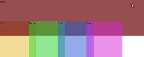
The first div is naturally at the bottom of the stack.

The first div is naturally at the bottom of the stack (z-index: 1).

When hovered and the transition begins, it first jumps on top of the Two div.

When hovered and the transition begins, it first jumps completely on top of the Two div as it simultaneously becomes opaque.
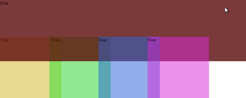
Notice that it is never partly on top and partly below any given div. It's entirely above divs Two and Three here, and entirely below divs Four and Five.

Notice that it is never partly on top and partly below any given div. It’s entirely above divs Two and Three here, and entirely below divs Four and Five.

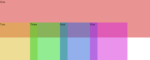
The transition is almost over now. It's worked it's way up to z-index 4 at this point.

The transition is almost over now. It’s worked it’s way up to z-index: 4 at this point.

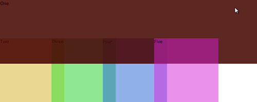
By the end of the transition, it has z-index of 6 and is on top of all the other divs.

By the end of the transition, it has z-index: 6 and is on top of all the other divs.

So remember: z-index is indeed one of the properties you can apply a transition to, but the transition has to happen in full steps, not necessarily as gradually as you might imagine it in your head.

* If the elements you’re transitioning z-index on are partially transparent (using HSLA for the background color, for instance) to begin with, you can kind of fake this effect. But if you look closely, you can still see the moment the element swaps places with another in the stack. It’s just harder to notice.
Flexbox syntax for IE 10

Yesterday in my presentation on CSS3 Layout I talked about the different syntaxes that the Flexible Box Layout module (Flexbox) has gone through on its journey to candidate recommendation. As I said in my talk, IE 10 didn’t have time to update to the new syntax before it came out last fall, so it uses the syntax that first came out in 2011, with the -ms- prefix tacked on.

Fortunately, Flexbox basically works the same way between IE 10 and the current syntax; it just uses some different property and value names. To help you keep track of the differences, I quickly created this table today comparing the current, standard-to-be syntax with the 2011 syntax that IE uses. This is not meant to be some comprehensive, precise reference, just a quick and dirty cheat sheet, but hopefully it will be useful to you (and me) someday. (more…)

CSS3 Layout presentation at In Control Orlando

Today I spoke at In Control in Orlando on CSS3 Layout. For a decade we’ve been using floats for creating CSS layouts, and while they’re still the best choice for creating most multi-column designs, we’ve all been frustrated by their quirks and limitations. So in this presentation, I talked about some of the new and exciting CSS layout techniques that are either working right now, right around the corner, or a little ways down the road. I focused on how Grid Layout and Flexible Box Layout (aka Flexbox) will be able to be used in the future to create layouts, but also how to use Flexbox in practical ways as a progressive enhancement technique for the layouts you’re crafting today.

You can view the slides on SlideShare, or download the slides here:

CSS3 Layout (PDF, 2 mb)

CSS3 Layout Demos

I showed a few examples of how to use Grid Layout and Flexible Box Layout and wanted to share my demo files with you so you could poke around in the code  if you like. The last two demos have fallback CSS in place so that they still look fine in other browsers; it was not part of my presentation to do that with the first two demos.

(more…)

View more posts:

Archives by Category

  • Announcements (32)

    Learn what's happening in my career or industry, including information about my speaking engagements and books.

  • Articles (40)

    Informational or theoretical articles about a variety of web design topics, including CSS, HTML, accessibility, usability, and visual design.

  • Inspiration (8)

    Collections of images or links to others' design work that I find inspiring and think you will too.

  • Tutorials (5)

    Step-by-step articles that you can follow along with to learn a particular web design technique, including CSS layout and CSS3 effects.

Archives by Month