In my CSS3 presentation that I’ve given several times over the past year, the part that seems to impress the audience the most is my demonstrations of media queries. I’m with them. I think media queries are perhaps the most useful and exciting piece of all the great new stuff that’s new to CSS3.
While creating effective, attractive, flexible layouts that adapt to the user’s screen size has always been possible, media queries add another layer on top of flexible layouts to make them even more adaptable to an even wider range of sizes, allowing you to really fine-tune the experience for even more users. Media queries allow you to selectively feed styles based on the characteristics of the user’s display or device, such as how much width is available in the viewport, whether it’s in portrait or landscape mode, or whether it can display color.
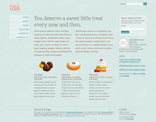
My demonstration of media queries is the fictional Little Pea Bakery site, created for my book Stunning CSS3: A Project-based Guide to the Latest in CSS. Here’s how it looks for most users (shown here at 990 pixels wide):
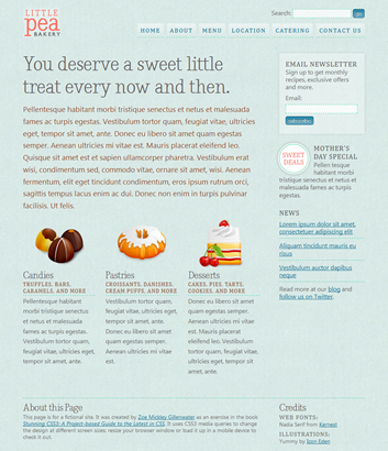
The "default" layout seen by most users.
It’s a liquid (also known as fluid) layout so it can adapt to the user’s screen size, but the design doesn’t look as good and isn’t as readable when the viewport width is very narrow or very wide. I used media queries to solve this problem. Here’s how the page looks over 1200 pixels wide:
The layout for wide screens (over 1200 pixels) adds a third column.

