Last week, Modernizr was updated to version 3, and with that upgrade gained some useful new tests for flexbox support. You now get four separate flexbox tests, producing eight different classes on your <html> tag that you can use to target browsers with different levels of flexbox support.
| Test | Supporting class | Non-supporting class | Useful for |
|---|---|---|---|
| Flexbox | flexbox |
no-flexbox |
Targeting browsers that support the current syntax |
| Flexbox (legacy) | flexboxlegacy |
no-flexboxlegacy |
Targeting/excluding browsers that support the old 2009 syntax, such as Safari 6 or Android 4.3 |
| Flexbox (tweener) | flexboxtweener |
no-flexboxtweener |
Targeting/excluding IE 10 |
| Flex line wrapping | flexwrap |
no-flexwrap |
Targeting browsers that support flex-wrap, or excluding browsers that support flexbox but donŌĆÖt support flex-wrap |
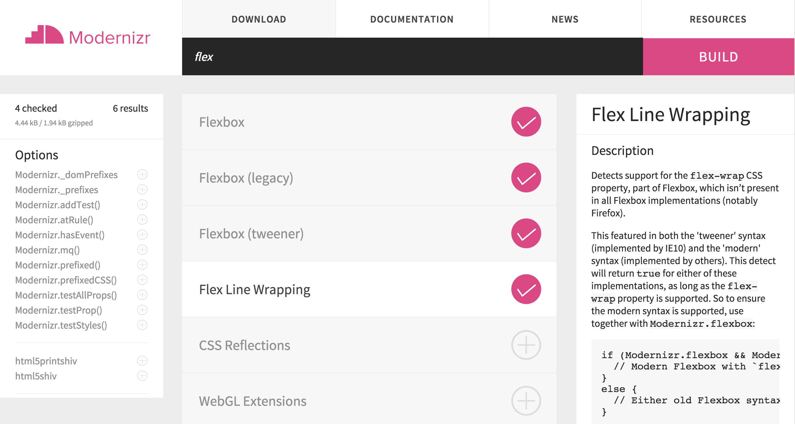
The four flexbox tests you can include in your Modernizr 3 build.
The most notable change is that you can now test whether the browser supports the flex-wrap property specifically. This is useful because some browsers supported the up-to-date flexbox spec without any browser prefix, but didnŌĆÖt support the flex-wrap property within that spec. This was problematic because it meant that you couldnŌĆÖt exclude these browsers by simply not including their browser-prefixed properties. They would get the same flexbox code you provided to full-featured browsers, but if you used flex-wrap in that code, the layout had the potential to break horribly.
The Modernizr site states that itŌĆÖs Firefox that suffers from this limitation, but this is inaccurate. ItŌĆÖs only old versions of Firefox, specifically 22 through 27. Firefox is currently (as of September 2015) at version 40, so itŌĆÖs unlikely that you still have a significant number of users on your site using version 27. However, the flex-wrap test is still useful as a safeguard for the small number of users that might be affected by a catastrophic layout failure that might occur if you write a layout that depends on the flex-wrap property.
For instance, letŌĆÖs say you want to use flexbox to lay out some sort of list so that you can use justify-content to equally distribute the items across the full width of their container. But you also want to use flex-wrap to allow them to wrap onto multiple lines on narrow screens.
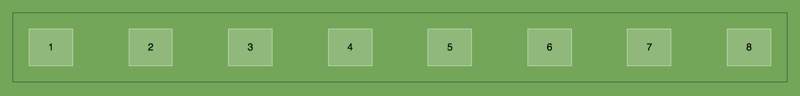
Full-width and equally spaced in the wide view.

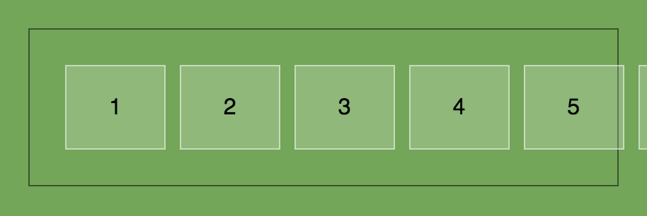
Items wrap to 2 rows or more in the narrow view.
To accomplish this while still supporting older, non-flexbox browsers, you might use display:inline-block as your starter CSS, then layer flexbox on top using the Modernizr .flexbox class.
.list {
    text-align: center;
}
.list-item {
    display: inline-block;
}
.flexbox .list {
    display: flex;
    flex-wrap: wrap;
    justify-content: space-between;
}
The problem here is that Firefox 22-27 will use the last rule, since it does support the current version of flexbox, but it wonŌĆÖt understand the flex-wrap part of the rule. This means it will always keep all of the links on the same line, and theyŌĆÖll overflow out of their container on narrow screens.
In Firefox 22-27, the items won’t wrap but instead will overflow from their container.
Even though this might affect only a tiny number of users, itŌĆÖs a major display problem thatŌĆÖs now entirely preventable thanks to Modernizr. A better approach would be to let old Firefox use the starter styles using display:inline-block, by hiding the last rule from these non-flex-wrap browsers. We can do this by appending the .flexwrap class onto the selector, ensuring that only browsers that support the current flexbox spec and the flex-wrap property will use the rule.
.flexbox.flexwrap .list {
    display: flex;
    flex-wrap: wrap;
    justify-content: space-between;
}
Using inline-block instead of flexbox, old Firefox will get the items wrapped, but simply not stretched across the full width as flexbox can provide.
Nearly all browsers support the current flexbox spec, but writing your CSS in a way like this using the new Modernizr classes provides a much safer experience for that small percentage of users with non-flexbox browsers.
DonŌĆÖt get me wrongŌĆöthere are still plenty of cases where non-flexbox CSS and flexbox CSS can co-exist without causing any problems. Most of the time, flexbox CSS just overrides other layout CSS by browsers that understand it, and you donŌĆÖt need to hide any styles using Modernizr. But in those cases where the CSS does come into conflict, Modernizr is now better than ever at helping you isolate flexbox styles in an intelligent way.
If you do use Modernizr to append flexbox classes, I recommend you install the Too Flexy bookmarklet in your browser to easily test your code. It toggles the flexbox class on your page to no-flexbox so you can get a peek at how the page looks in both cases without having to fire up your old browsers every single time.

