I’ve been playing around with the new multi-column properties of CSS3 (column-count, column-width, and so forth), and I’ve come to the conclusion that they’re sadly not ready to really use. Sure, use them in experimental sites, and maybe even in mainstream sites in small doses with very particular types of content. But for most content, I found that there’s not enough control over how the content is distributed between columns to make them reliable. I’m not sure if the browser behavior I’ve been seeing is correct or not; the spec is unfortunately not well defined enough to make it clearŌĆöat least to meŌĆöof how browsers ought to be handling some of the problems I ran across.
Balancing column heights
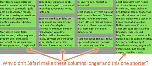
The first problem is how the browser should handle one or more extra lines of content if the amount of content cannot fill up each column equally. In my opinion, the extra content should come at the bottom of the first columns, so that columns further to the right are never longer than columns further to the left. This is pretty standard practice in print design, and having it any other way just looks really strange. At least to me. Take a look and you decide:

The last column has one extra list item and line than the previous columns.
Doesn't this look weird?
Another example of the last column being longest.
You can check out the first demo page yourself. Resize the window and see how each browser handles column number, placement, and height.
It seems like the column-fill property is supposed to address this problem, but I may be misunderstanding what it’s supposed to do. In any case, my testing has shown that no browser supports it, even with browser-specific prefixes. So, we’re left with these unbalanced, awkward looking columns.
In some cases, I understand why the browser is making later columns taller than earlier ones. For instance, there’s a bottom margin on one of paragraphs that happens to fall at the end of one of the columns, leaving a gap and making that column shorter than the following column. I know there are cases when this behavior is desirable and necessary given the content. But we ought to be able to control it, and we can’t right now, and the default browser decisions about how to fill look weird to me in many cases.
Flowing margin and padding across columns
The second problem is how the browser should handle margin and padding on elements inside the columns. Webkit will let margin and padding be split in between columns; even when it doesn’t split a bottom margin, it will often let the entire margin show up at the top of a column. This can result in some extremely ugly and bizarre stuff:

Safari and Chrome break margin and padding between columns.
Check out the second demo page with extra margin and padding added.
Firefox, on the other hand, expands the height of the column area to accommodate the padding, and let’s margin escape out the bottom (margin collapsing at work, I guess) rather than letting it show up at the top of a column.
Firefox makes the bottom margins on the last items in the columns just disappear, instead of splitting those margins across columns or allowing them to show at the top of a column.
Again, the spec doesn’t seem to say anything about which implementation is correct (does it?), but in my opinion, the way Webkit handles it just has to be wrong. Margin and padding are never ever split, are they? And even if they are split in other non-column CSS layout scenarios, it certainly doesn’t make sense to do it in columns. Again, it breaks with print design conventions; while I know web design does not have to emulate print, there are certain typographic conventions that we’ve preserved on the web for readability’s sake, and breaking them would make most people say it looked “wrong.” I think this is one of those cases, and in my opinion, it’s the biggest deal-breaker for using columns right now. Or at least, using them in Webkit-based browsers.
Again, if there are fringe cases where it makes the most sense to split the margin and/or padding, by all means let’s do it. But we need a CSS property to control that, and it doesn’t look like there is one in the spec now. So for now, I hope Webkit changes how they handle this to match up with Firefox’s more intuitive choice, and that the W3C clarifies this in the spec.
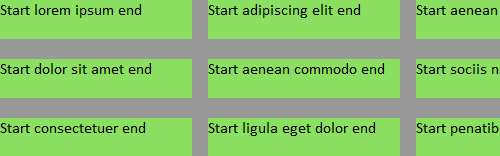
Breaking content across columns
Finally, the third problem is that neither Firefox nor Webkit seem to support the column break properties. For instance, adding break-inside: avoid-column; to the li elements should keep the content in each list item from breaking across columns. Unfortunately, it doesn’t work right now.

The text "Start sociis natoque end" is all one list item, but both Webkit and Firefox break content within the list items.
The third demo page is the same as the first one, but it has the break-inside properties added. As you can see, it behaves the same as the first demo.
Controlling breaking isn’t necessarily a big deal with a simple series of paragraphs, but it becomes more important on lists with brief list items, as shown in the image above, and when you have headings mixed in the text, as you definitely want to make sure that headings stay with their following text. Not having support for the breaking properties can really impede usability and limits the usefulness of multi-columns.
Next steps? Workarounds?
Given these problems, multi-column layout isn’t very useful to me right now. Honestly, it’s always been something that I’ve thought should be used only sparingly, in very particular cases. But with these problems, I’m not going to use it in any cases. I’m really hoping that the spec continues to evolve and that browsers continue to update their implementation of these features. (I’m mainly looking at you, Webkit.)
In the meantime, if anyone has any workarounds for these problems, I’d love to hear them!


It works if, like you say, you implement it with very simple, short blocks of content (see IA‘s site for an example.
I don’t really see the point of using it on screen for anything more ambitious. Scrolling back up a page to continue reading is a PITA.
Hi Leon. Yes, I agree it is not good for long stretches of text. But as my test pages show, these problems can very easily rear their heads in short pieces of text. And, one of the best uses for multi-columns, IMO, is for short lists, but my second list example looks like a train wreck in Safari/Chrome.
I think Firefox behaves quite sensibly on most of your tests, and its behaviour could possibly be a starting point for standardization. The obvious missing piece is of course column-break (Bug 549114 https://bugzilla.mozilla.org/show_bug.cgi?id=549114). The Webkit bug is at https://bugs.webkit.org/show_bug.cgi?id=15552 but only for “before” and “after”.
In a few cases the first column has not maximum height, but at least 90 % of the time it does. In the few cases it does not it seems to be that its because of bottom margin. It seems sensible.
However, fixing bug 549114 is not trivial as it will affect the column height/distribution algorithm. What if one column becomes so high that the last column is not needed? E.g. I have an unbroken list that ends up in column 2. The column width makes for 4 columns in total, but all other content actually fit in the 3d. Should we have a 4th, empty, column?
While I don’t think columns should yet be relied upon as part of a design, they can be used for improved readability on liquid layout sites (or very wide fixed layout). I view columns as an enhancement.
I haven’t written the explanation of issues in my Grid of CSS3 Columns and Browser Support. This post did bring up several concerns that I should add to my explanations: while CSS3 columns may be supported in a browser, they may not always look as intended.
Thanks for all youre hard work on this post. I’ve been working an experimental site for a few weeks and just recently started playing with columns. I haven’t run into any of these issues, but that’s largely because I’m only using two or three columns. My hunch is that users won’t notice a lot of the margin and padding issues that you bring up here with smaller numbers of columns – especially if they’re on the wider side.
Unfortunately, while a widely anticipated feature of CSS3, I think the column property is past it’s prime. We’ve become so accustomed to scrolling down, paginating longer stories – that I’m not sure putting content in columns will benefit the content.
As a design element for short pieces as mentioned before, maybe, but as a way to read the web – nope.
All very true. There’s one other issue that Firefox & WebKit handle differently, although I’m not sure if it meets your definition of a deal-breaker. Consider an element with the following styles applied:
div { column-count: 5; column-width: 100px; width: 800px; }The spec says only that in this case,
column-countbecomes a maximum value. Firefox handles this by creating five columns of about 150px each (usingcolumn-widthas a minimum value); WebKit creates five columns of exactly 100px each.Tried posting this before, but seems to have disappeared…
There’s another difference between browsers on elements which have both
column-countandcolumn-widthapplied. The spec states that in that situation,column-countis a maximum value. So consider code like this:div { column-count: 5; column-width: 100px; width: 800px; }Firefox creates five columns of about 150px each, to fill the width of the div; WebKit creates five columns of exactly 100px each, leaving a large blank area to the right of the element.
Not sure which of the two is correct, so the spec needs to specify more clearly.
Lars, I think in some cases an empty column is indeed preferable. Firefox does this sometimes on the list test, and I quite like it for that use case. Again, it’s the sort of thing that we should be able to control, because it depends on both the content and the designer’s preferences.
Peter, yes, that’s another area that is not clear. I don’t have strong feelings on which seems more “right” to me. Probably another “it depends,” personal preference thing.
Good write up Zoe, I tried this myself with my personal blog redesign this time last year but pretty much came up with the same reasoning for ditching it. The column break stuff was the final nail for me at the time.
Regards, Karl
Adding “-webkit-margin-bottom-collapse: separate;” to the element that has columns seems to fix the problem you address in the flowing margin section. Is this the rule you had in mind?
I didn’t know about this property–thanks! I added it to the ul element and it did fix the padding splitting across columns, but not the margin. But even that is a good start!
I just tried this on the second demo page in Chrome 44 and although the property is recognised, it doesn’t seem to have any effect.
¤Öü
Also of note (although it’s more apple’s problem that the multi-column spec per se) is that when a print command is invoked, the columns disappear completely in safari.
Firefox maintains the proper columns and flow, presumably because it’s not using webkit?
Yes, sadly, there are several more problems with columns than the few I chose to “showcase” here, including the printing problem. Older versions of Safari would make the columns flow across the pages, instead of flowing across just one page, then starting over again on the next, which was completely disorienting and horrible for reading. So I guess instead of actually fixing the problem they just decided to avoid it altogether by making columns go back to a single column when printing. Another thing they will hopefully fix soon!
Breaking content across columns:
In googles chrome you can use display:inline-block to avoid breaking inside the element.
I also found that
display: inline-block;does exactly whatcolumn-break-inside: avoid;thanks to this article at Symphonious.Safari 5.0.3 gets the margin flowing over onto the top of the next column.
Chrome 11.0.696.3 doesn’t, which is nice.
Firefox 3.6.17 doesn’t either.
Opera 11.01 has no multi-column support. What’s up with that?
Eystein, the latest beta from Opera supports multi-column ¤Öé