One good way to learn a new technology is to take something made with the existing methods and try to recreate it with the new thing. Take flexbox, for example. Philip Walton showed us with his “Solved by Flexbox” demos that flexbox can make a lot of the layouts that were possible but painful with traditional CSS2 methods a lot easier to create and more flexible to different content and user scenarios. I want to walk you through a similar sort of design challenge: taking an existing layout, converting it to flexbox, and then seeing how flexbox can take it to the next level.
My inspiration for a layout to convert came from Dan Mall’s write-up of his Crayola web site redesignŌĆöspecifically, the responsive screenshots stretching across the full-width of the viewport, displaying how the layout could adapt from tiny to huge.
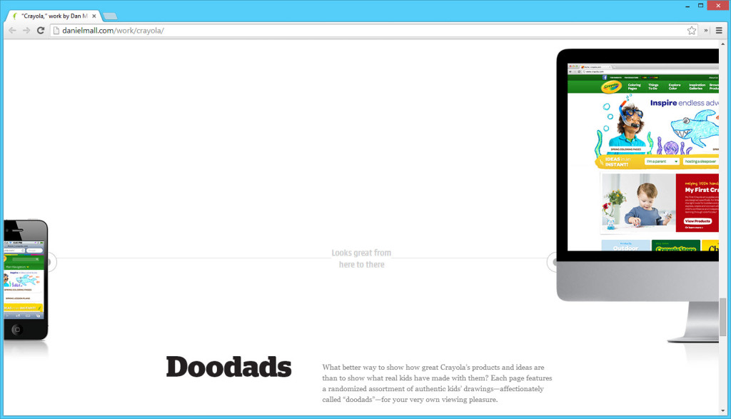
Dan Mall’s full-screen layout of a mobile phone pinned to the left and a desktop monitor pinned to the right, both bottom aligned, with text in between.
Seeing a full-width layout with chunks pinned to each side and another block in the middle made me think of flexbox’s justify-content:space-between, so I decided to try to see if I could recreate this layout with flexbox. Again, I took this as a challenge and learning experience for myselfŌĆönot because there was anything wrong with Dan’s implementation. How many ways could I create this layout, and what pros and cons did each method have?
The display:table version
Dan was using absolute positioning, so no need for me to try that route. That option is covered!
Another option I wanted to compare with flexbox was a display:table layout, often a good fallback for flexbox layouts, particularly full-width ones. To make display:table work, I needed to put the left-most column first in the source, then the middle one, then the last one.
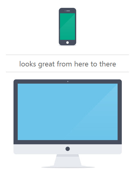
<div class="layout-table">
    <figure class="stretch-photo small">
        <img src="img/flexbox_stretch_small.png" width="58" height="127" alt="mobile"/>
    </figure>
    <h2 class="stretch-title"><span>looks great from here to there</span></h2>
    <figure class="stretch-photo big">
        <img src="img/flexbox_stretch_big.png" width="361" height="294" alt="desktop"/>
    </figure>
</div>
I don’t consider this source order ideal, as the middle text is, semantically speaking, a heading for the two images; this source order won’t result in the best reading order for users of assistive technologies like screen readers. Unfortunately, that’s sometimes what you’re stuck with when using display:table. But, if you can’t have perfect HTML, at least you can have nice, simple CSS!
.layout-table {
    display: table;
    width: 100%;
}
.layout-table > * {
    display: table-cell;
    vertical-align: bottom;
}
.layout-table .stretch-title {
    width: 100%;
    padding-bottom: 4rem;
}
.layout-table .stretch-title span {
    display: block;
    border-bottom: 1px solid #ccc;
}
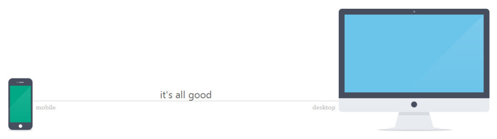
Below is what my table-layout version looks like. I wasn’t going for identical with Dan’s version, just the same basic layout pattern. One difference you’ll notice is that in my version the text is centered between the two images, while in Dan’s version the text is not centered between the images but rather is centered with the blocks of text above and below it. This is not a pro or con for either version, in my opinion, just a difference. It depends on what alignment you want.
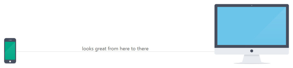
My version of the here-to-there layout pattern, using display:table-cell.
The flexbox version
So, with the display:table version as my point of comparison, I first set out to fix the source order.
<div class="layout-flex-basic">
    <h2 class="stretch-title">looks great from here to there</h2>
    <figure class="stretch-photo small">
        <img src="img/flexbox_stretch_small.png" width="58" height="127" alt="mobile"/>
    </figure>
    <figure class="stretch-photo big">
        <img src="img/flexbox_stretch_big.png" width="361" height="294" alt="desktop"/>
    </figure>
</div>
So similar, and yet so much better!
To use flexbox on this beautiful HTML, first set display:flex on the container for the three chunks. (If you want to use the browser-specific variants of the flexbox CSS too, go for it.) I also set align-items:flex-end to vertically align the three chunks, now “flex items,” along their bottoms.
.layout-flex-basic {
    display: flex;
    align-items: flex-end;
}
This gets me the three chunks lined up in a row, but of course the heading text is first in the line since it’s first in the HTML. I can move the mobile phone image in front of it by using the order property. All flex items have order set to 0 by default, so -1 moves the mobile phone image before all its siblings, leaving the heading to now take up the middle position.
.layout-flex-basic .small {
    order: -1;
}
The only thing left is to stretch the heading to take up all the space in the line left over after the two images have taken their shares. Setting flex:1 solves that simply. I also gave it some margin-bottom to move it up from the bottom edge a bit and a border to create the line between the two images.
.layout-flex-basic .stretch-title {
    flex: 1;
    margin-bottom: 4.5rem;
    border-bottom: 1px solid #ccc;
}
And that’s it. Not too bad, right? Apart from the browser-specific variants, which you can get Sass or another tool to add for you, it’s really no more CSS than the display:table version. It looks identical to that version, but has a more accessible and semantic source order.
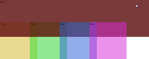
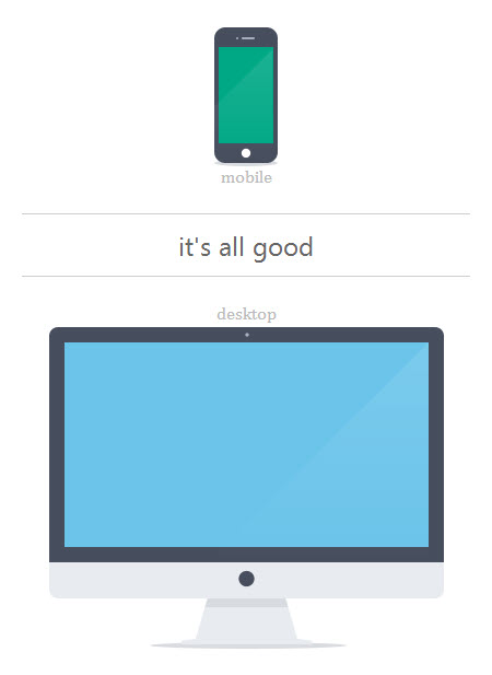
The advantage to having proper source order on the flexbox version is that I can easily change the layout on narrow screens so that the heading is on top, in its natural source order, with the two images stacked below. Or, I can use order again to instead move the heading below the images.
@media screen and (max-width:50em) {
    .layout-flex-basic {
        flex-wrap: wrap; /* allow two rows */
        justify-content: space-between; /* move the images to opposite ends of their row */
    }
    .layout-flex-basic .stretch-title {
        flex: 1 0 100%; /* make it wrap to its own line */
        order: 1; /* move to the end */
        margin-bottom: 0;
        margin-top: 1em;
        border-bottom: none;
        border-top: 1px solid #ccc;
    }
    .layout-flex-basic .small {
        order: 0; /* move back to its normal spot */
    }

Even though the heading text comes before both of the images, I can use the flexbox order property to move it below them visually on narrow screens.
I can’t do this with the display:table version. I can change the CSS on narrow screens, sure, but the HTML source order means my heading will still be stuck in the middle of the two images. HTML source order really does matter.
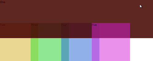
Of course, maybe I want the heading in the middle on really tiny screens, smaller than the combined width of my two images. I can shuffle things around quite easily with flexbox.
@media screen and (max-width:480px) {
    .layout-flex-basic {
        flex-direction: column; /* stack vertically */
        flex-wrap: no-wrap; /* all in one column */
        align-items: center; /* horizontally centered */
    }
    .layout-flex-basic .stretch-title {
        flex: 1 0 auto; /* this now affects its height, not its width */
        order: 0; /* move back to its normal spot */
        width: 100%;
        margin: 1em 0;
        padding: .5em 0;
        border-bottom: 1px solid #ccc;
        border-top: 1px solid #ccc;
    }
    .layout-flex-basic .small {
        order: -1; /* put back on top */
    }
}
Changing the visual order yet again on even narrower screens.
Extending the flexbox version
The flexbox version can also be extended in more ways that the display:table version. I can add more pieces and place them with more precision and flexibility than with display:table. Let’s say I want to add a caption to each image, but aligned to the side of its image, as shown below.
Adding text captions next to instead of below their images adds an extra layer of complexity. But it’s totally doable.
Here’s the logical HTML for that.
<div class="layout-flex-advanced">
    <h2 class="stretch-title">looks great from here to there</h2>
    <figure class="stretch-photo small">
        <img src="img/flexbox_stretch_small.png" width="58" height="127" alt=""/>
        <figcaption>mobile</figcaption>
    </figure>
    <figure class="stretch-photo big">
        <img src="img/flexbox_stretch_big.png" width="361" height="294" alt=""/>
        <figcaption>desktop</figcaption>
    </figure>
</div>
To do this with flexbox, I turned each <figure> into a flex container itself. They’re still flex items, along with their sibling <h2>, but now the <img> and <figcaption> inside each <figure>┬Āare flex items too. That means they can be aligned in the various ways that flexbox allows.
.layout-flex-advanced .stretch-photo {
    display: flex;
    align-items: flex-end;
}
I want each caption to hang out the side of its parent <figure>, so I need to hard-code the width of each <figure> (not great, I know) so it doesn’t try to expand to hold its caption. I also need to make sure nothing inside the <figure> flexes, but instead remains at its native width.
.layout-flex-advanced img,
.layout-flex-advanced figcaption {
    flex: 0 0 auto;
}
.layout-flex-advanced .small {
    width: 58px;
}
.layout-flex-advanced .big {
    width: 361px;
}
This will indeed make each caption overflow its <figure>, but both will overflow out the right side, since the content inside each runs from left to right.
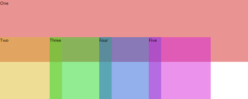
By default, both captions overflow out of their figure containers on the right side. This doesn’t look so hot on the image on the right, whose caption barely shows in the viewport.
But, I can change this using flexbox’s flex-direction property. You’ve perhaps heard that you can use flex-direction to switch content from row to column layout. But those aren’t the only two values flex-direction has. You can also set it to column-reverse or row-reverse. They work the same as their column and row counterparts, but each starts its stacking from the opposite direction of what you’d normally expect. So, for a left-to-right language like English, flex-direction:row would lay the flex items out from left to right, but flex-direction:row-reverse would lay them out from right to left. That’s exactly what we want to happen on the big <figure>: place the monitor image on the right side of the row (first in the source), then its caption to its left (second in the source).
.layout-flex-advanced .big {
    width: 361px;
    flex-direction: row-reverse;
}
That takes care of it, creating the layout in the screenshot above.
Of course, at narrow screen widths we can instead place the captions back under their imagesŌĆöor on top of them, or really wherever we want, thanks to flexbox.
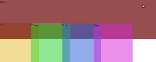
The first image has its caption below, the second has its caption above, and the heading is sandwiched in between.
The best part about this is that all of this flexbox stuff can be added as progressive enhancement. I could use absolute positioning, like Dan did, as my base, and build on top of it using flexbox, which offers me additional content placement and alignment options that absolute positioning can’t achieve. (In this demo, I didn’t use absolute position or anything else to support older browsers, simply because this is a demo, not a real-life page, and I just really needed to get this blog post out the door without obsessing too much over it! That’s a bad habit of mine, which my very infrequent blogging indicates. Maybe I can create the progressively enhanced version of this demo as a followup blog post…)
This here-to-there layout pattern doesn’t have to be used just for responsive screenshots, of course. I could see it being used for all sorts of thingsŌĆöanything with a comparison or before-and-after, such as before and after screenshots of a web site you redesigned. Or, what about a hero banner for a craft or construction tutorial showing a photo of the raw materials on one side and a photo of the finished product on the left? Or, a recipe with a photo of the ingredients on the left, name of the dish in the middle, and photo of the completed dish on the right? Or, just show how a cute little baby has gotten so much bigger:
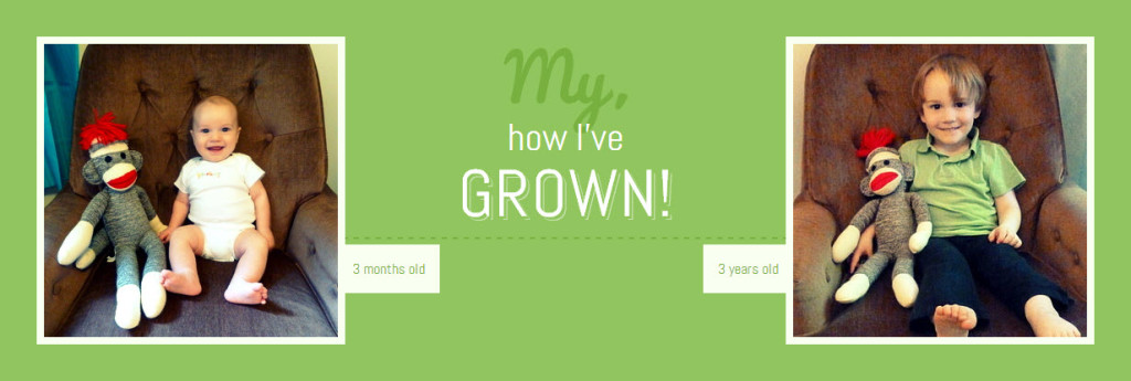
This version uses the same markup structure as the others, just with a little extra visual styling. (Isn’t my son cute?)
To see how this last demo was made, go to the demo page for all four versions and check out the CSS. As always, be sure to resize your browser window to see how it adjusts at different widths. And of course, view it in a browser with good flexbox support. As if you smart people would use anything else!