Yesterday I spoke at Blend Conference┬Āin Charlotte on Putting Flexbox into Practice. You’ve probably heard about flexbox (the CSS Flexible Box Layout module), since it’s the┬Āmost fully developed and well supported of CSS3ŌĆÖs wide array of new techniques for creating page layouts, and because it┬Āallows you to create fluid, responsive layouts much more easily than current float-based methods. I talked about how to actually put it to use in the real worldŌĆötoday. I covered the syntax you’ll be able to one day use to build an entire multi-column page layout with flexbox, but also demonstrated┬Āsome practical ideas for how to use flexbox as progressive enhancement, adding it in bits and pieces on individual page components with graceful fallbacks.
You can view the slides on┬ĀSlideShare, or download the slides here:
Putting Flexbox into Practice (PDF, 900 kb)
The demo
To demonstrate the flexbox features, I created a S’mores Builder page. Some day, I intend to turn it into a functioning site devoted to s’mores. (I really love s’mores. A lot.) But for now, check it out to see what flexbox can do.
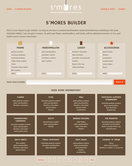
The S’mores Builder page is responsive and laid out entirely with flexbox, with some fallbacks for non-supporting browsers in certain places.

