This is just a reminder that you can apply transitions to an element’s z-index (aka, where it lays in the stack), but only by stepping through the layers. The browser has to keep z-index in whole numbers. This makes total sense, but it’s something I forgot about on a recent project.
I was working on an interface with overlapping elements, and I wanted whichever one was hovered to come to the front of the stack. I wanted this move to the front to look smoother, instead of one element just jumping out from behind another one suddenly. “Aha!” my brain said. “I will add a transition!” But my brain hadn’t thought this all the way through, and, of course, it didn’t work.
If you stop to think about it (which I eventually did), this makes perfect sense. If you want to take one element with z-index:1 and transition it to lay on top of another element with z-index:2, how in the world is the browser supposed to create intermediate steps between those two values? You can’t have an element with a z-index value of 1.5. An element can’t┬Ākinda┬Āoverlap another element. Either it’s above or below. The browser can’t create some weird, merged together state where the two elements are on the same level and intermixing, both partially transparent on just the spots that are sharing the same level.*
What the browser┬Ācan┬Ādo is increment the z-index value in whole numbers over the course of your transition duration. So, if I have an element with a z-index value of 1 and I want to gradually get to 10, the browser can first set z-index to 2, then 3, then 4, and so on. If you have a short transition duration or a long way to go from your starting value to your ending value (like changing z-index from 1 to 1000), it will step through these changes very quickly.
Here’s a demo of z-index transitioning slowly so you can see how the browser increases the z-index value step by step; hover over the block labeled One to see it happen. Here are some screenshots of the same demo taken along the course of the transition.
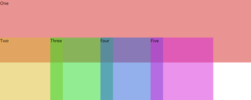
The first div is naturally at the bottom of the stack (z-index: 1).
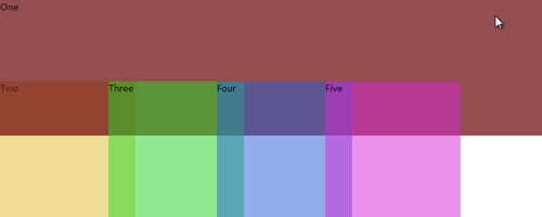
When hovered and the transition begins, it first jumps completely on top of the Two div as it simultaneously becomes opaque.
Notice that it is never partly on top and partly below any given div. It’s entirely above divs Two and Three here, and entirely below divs Four and Five.
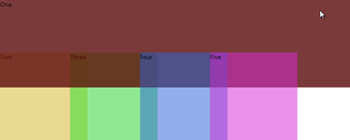
The transition is almost over now. It’s worked it’s way up to z-index: 4 at this point.

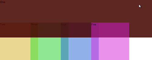
By the end of the transition, it has z-index: 6 and is on top of all the other divs.
So remember: z-index is indeed one of the properties you can apply a transition to, but the transition has to happen in full steps, not necessarily as gradually as you might imagine it in your head.
* If the elements you’re transitioning z-index on are partially transparent (using HSLA for the background color, for instance) to begin with, you can kind of fake this effect. But if you look closely, you can still see the moment the element swaps places with another in the stack. It’s just harder to notice.

