I’ve been playing around with the new multi-column properties of CSS3 (column-count, column-width, and so forth), and I’ve come to the conclusion that they’re sadly not ready to really use. Sure, use them in experimental sites, and maybe even in mainstream sites in small doses with very particular types of content. But for most content, I found that there’s not enough control over how the content is distributed between columns to make them reliable. I’m not sure if the browser behavior I’ve been seeing is correct or not; the spec is unfortunately not well defined enough to make it clearŌĆöat least to meŌĆöof how browsers ought to be handling some of the problems I ran across.
Balancing column heights
The first problem is how the browser should handle one or more extra lines of content if the amount of content cannot fill up each column equally. In my opinion, the extra content should come at the bottom of the first columns, so that columns further to the right are never longer than columns further to the left. This is pretty standard practice in print design, and having it any other way just looks really strange. At least to me. Take a look and you decide:
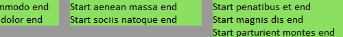
The last column has one extra list item and line than the previous columns.
Doesn't this look weird?
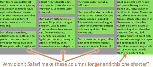
Another example of the last column being longest.
You can check out the first demo page yourself. Resize the window and see how each browser handles column number, placement, and height.
It seems like the column-fill property is supposed to address this problem, but I may be misunderstanding what it’s supposed to do. In any case, my testing has shown that no browser supports it, even with browser-specific prefixes. So, we’re left with these unbalanced, awkward looking columns.
In some cases, I understand why the browser is making later columns taller than earlier ones. For instance, there’s a bottom margin on one of paragraphs that happens to fall at the end of one of the columns, leaving a gap and making that column shorter than the following column. I know there are cases when this behavior is desirable and necessary given the content. But we ought to be able to control it, and we can’t right now, and the default browser decisions about how to fill look weird to me in many cases.
Flowing margin and padding across columns
The second problem is how the browser should handle margin and padding on elements inside the columns. Webkit will let margin and padding be split in between columns; even when it doesn’t split a bottom margin, it will often let the entire margin show up at the top of a column. This can result in some extremely ugly and bizarre stuff:

Safari and Chrome break margin and padding between columns.
Check out the second demo page with extra margin and padding added.
Firefox, on the other hand, expands the height of the column area to accommodate the padding, and let’s margin escape out the bottom (margin collapsing at work, I guess) rather than letting it show up at the top of a column.
Firefox makes the bottom margins on the last items in the columns just disappear, instead of splitting those margins across columns or allowing them to show at the top of a column.
Again, the spec doesn’t seem to say anything about which implementation is correct (does it?), but in my opinion, the way Webkit handles it just has to be wrong. Margin and padding are never ever split, are they? And even if they are split in other non-column CSS layout scenarios, it certainly doesn’t make sense to do it in columns. Again, it breaks with print design conventions; while I know web design does not have to emulate print, there are certain typographic conventions that we’ve preserved on the web for readability’s sake, and breaking them would make most people say it looked “wrong.” I think this is one of those cases, and in my opinion, it’s the biggest deal-breaker for using columns right now. Or at least, using them in Webkit-based browsers.
Again, if there are fringe cases where it makes the most sense to split the margin and/or padding, by all means let’s do it. But we need a CSS property to control that, and it doesn’t look like there is one in the spec now. So for now, I hope Webkit changes how they handle this to match up with Firefox’s more intuitive choice, and that the W3C clarifies this in the spec.
Breaking content across columns
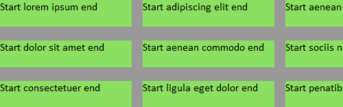
Finally, the third problem is that neither Firefox nor Webkit seem to support the column break properties. For instance, adding break-inside: avoid-column; to the li elements should keep the content in each list item from breaking across columns. Unfortunately, it doesn’t work right now.

The text "Start sociis natoque end" is all one list item, but both Webkit and Firefox break content within the list items.
The third demo page is the same as the first one, but it has the break-inside properties added. As you can see, it behaves the same as the first demo.
Controlling breaking isn’t necessarily a big deal with a simple series of paragraphs, but it becomes more important on lists with brief list items, as shown in the image above, and when you have headings mixed in the text, as you definitely want to make sure that headings stay with their following text. Not having support for the breaking properties can really impede usability and limits the usefulness of multi-columns.
Next steps? Workarounds?
Given these problems, multi-column layout isn’t very useful to me right now. Honestly, it’s always been something that I’ve thought should be used only sparingly, in very particular cases. But with these problems, I’m not going to use it in any cases. I’m really hoping that the spec continues to evolve and that browsers continue to update their implementation of these features. (I’m mainly looking at you, Webkit.)
In the meantime, if anyone has any workarounds for these problems, I’d love to hear them!


Wow – this explains a lot! I thought I was going nuts with the difference in column heights. Thanks Zoe. ¤Öé
You should go upvote the issue in Bugzilla: https://bugzilla.mozilla.org/page.cgi?id=voting/user.html&bug_id=549114#vote_549114
Good rundown of why CSS3 columns are unusable! Disappointed that as far as I can tell little has improved in the last 2.25 years…
Looks like dude found a workaround: http://bengillies.tiddlyspace.com/masonry.css
I added overflow: auto; max-height: 4000px; to the div that I didn’t want broken up, and it worked great
I don’t know if this solves everyones problems with columns (of which I’m sure there are many!) but it certainly solved mine, many thanks, +1!
The alternative to fixing “Breaking content across columns” is to add display:inline-block on the elements inside the column.
It helped me to add the following tag to the elements that get hidden:
-webkit-backface-visibility: visible, as I had this standard set hidden for all elements for fluid animation purposes.
I simply add ┬½ display : inline-block; ┬╗ on my paragraph tags. This way, they aren’t cut in half to display on two separate columns. This leads to unequal column heights, but I can very easily live with that.
Add some margin on these same paragraph tags and, since they are displayed whole in a single column, your margin properties will apply and the breathing space your text needs will be respected. Solves this deal-breaking for me… using only CSS.
Might not be the right solution for everyone… possibilies are, as always, endless… but it does the trick for my needs of displaying texts and images.
Hope this helps…
I agree that there is not enough control. CSS3 columns is a great idea but need more work. I wrestled with it for a while, trying to use hidden divs for js sliding overlays – totally screwed it up.
I know this article goes way back, but I’ve been documenting some more issues I’ve noticed in this pen: http://codepen.io/dsongman/pen/qEEWrz
Thanks for the thoroughness you put into these articles!
For what it’s worth, I was just running into this issue. Columns looked fine in Safari and Firefox, but in Chrome I found that the first column was higher than the others. After fruitlessly trying several solutions I’d read about, I went for
column-break-inside: avoid;after Eystein’s suggestion. That still didn’t work, but when I added-webkit-column-break-inside: avoid;it fixed it!Just discoverede that the uneven columns in Webkit (after using
inline-blockto avoid overflowing margins) can be solved by applyingposition: relativeto theinline-block‘ed elements within the columns. Haven’t tested extensively, but solved my current headache.