Yesterday I spoke at Blend Conference┬Āin Charlotte on Putting Flexbox into Practice. You’ve probably heard about flexbox (the CSS Flexible Box Layout module), since it’s the┬Āmost fully developed and well supported of CSS3ŌĆÖs wide array of new techniques for creating page layouts, and because it┬Āallows you to create fluid, responsive layouts much more easily than current float-based methods. I talked about how to actually put it to use in the real worldŌĆötoday. I covered the syntax you’ll be able to one day use to build an entire multi-column page layout with flexbox, but also demonstrated┬Āsome practical ideas for how to use flexbox as progressive enhancement, adding it in bits and pieces on individual page components with graceful fallbacks.
You can view the slides on┬ĀSlideShare, or download the slides here:
Putting Flexbox into Practice (PDF, 900 kb)
The demo
To demonstrate the flexbox features, I created a S’mores Builder page. Some day, I intend to turn it into a functioning site devoted to s’mores. (I really love s’mores. A lot.) But for now, check it out to see what flexbox can do.
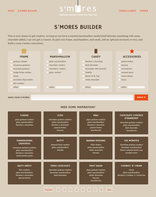
The S’mores Builder page is responsive and laid out entirely with flexbox, with some fallbacks for non-supporting browsers in certain places.
Related resources
Here are several links to related resources, a few of which are in the slides plus many more that were not but which I recommend and think you’ll find useful.
General info
Articles and tutorials
- “Using CSS flexible boxes” by Mozilla Developer Network
- “Flexbox ŌĆö fast track to layout nirvana?”┬Ā and “Advanced cross-browser flexbox” by Chris Mills for Dev.Opera
- “Responsive Design of the Future with Flexbox” by Ben Gremillion for Treehouse
- “ŌĆ£OldŌĆØ Flexbox and ŌĆ£NewŌĆØ Flexbox” and “Using Flexbox: Mixing Old and New for the Best Browser Support” by Chris Coyier
- “Flexbox syntax for IE 10” by me
Tools
- Flexy Boxes code generator by Pete Boere (also great for learning which properties and values from different syntaxes correspond, and lists some of the browser bugs present in older implementations)
- CSS Flexbox Please! syntax testing/visualizer tool by Eiji Kitamura
- flexplorer syntax testing/visualizer tool by Bennett Feely
- sass-flex-mixin by mastastealth
- flexbox.scsss by cimmanon
- Another Sass/SCSS mix-in by Adam Johnson


Thank you so much for this post. I have been working for a month now to try and find a good example that helps me understand how flexbox has to be built to work like the s’mores page does. Yours is the first that actually covers it all, just by giving us some source code for the html and css to make the excellent s’mores page. Thank you!
there is a problem in firefox which is explained here pretty well http://www.wpmemorize.com/2013/css-flexbox-to-design-flexible-layouts/
so i thought it will help other developers resolving there issues.
This is great … except this demo site is viewed all wrong on my firefox 26.0 .. and practically not working ..
Yes, as noted on the demo site and in the slides, it will not look right in Firefox and should be viewed in a browser with better flexbox support. Firefox doesn’t support flex-wrap yet. Version 28 is supposed to.
Thank you for the share, since i discovered flexbox, i’ve never made a single float.
<3
Thank you for the post, but the demo site doesn’t work. Any chance to get it?
Hmm, you’re right. I’ll look into why it’s down. Thanks for the heads up!
Thanks to you. I’m a Web Design teacher in Spain and I’m preparing a demo to my pupils. I would greatly appreciate you tell me a way to get de source of your demo.
The site should be back up now. Let me know if you’re still not seeing it. Good luck with your class! That’s cool that you’re showing them flexbox.
Yes, it works. Thank you very much.
Very nice post !!!
Thank you.
There is a height problem in Internet Explorer.
If you like i can send you a screenshot