I’ve been on my soapbox a lot lately, so I decided it was time to step down for a bit and do a nice, non-controversial CSS tutorial. Wouldn’t you agree?
The inspiration for this tutorial came from the “Who we are” page on the Clearleft site. Try resizing the textŌĆöonly the text, not the whole pageŌĆöand notice how the photos move farther apart and closer together. They always stay aligned with the names they go with, and the overall height of the photo block never gets too far off the height of the block of text to the left. So, the design always appears balanced.
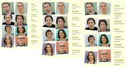
The images remain the same size but change their spacing as the text size changes.
I love this effect; it’s a very clever way to fill up the entire available space with images without having to actually scale the images. It’s basically another take on what I call sliding composite images. There are an unlimited number of ways to create sliding composite imagesŌĆöbackground positioning, absolute positioning, margins, etcŌĆöbut I wanted to share one way to accomplish the particular effect shown on the Clearleft site. Luckily, it’s really quite simple.
Here’s my version of the effect. Try resizing your browser window and text size to see the flowers move farther apart and closer together.
And here’s how I did it…
The markup and images
I start with a definition list for the markup of the list of flowers beside the images. (You could also use an unordered list combined with headings, paragraphs, and/or spans. Use whatever makes the most sense, semantically, for your content.) The definition list is contained in its own div, which follows another div containing a few paragraphs of text. I’ve got them both in a wrapper div to prevent float drop.
<div id="wrapper">
	<div id="description">
		<h1>The amazing five-flowered vine</h1>
		...
	</div>
	<div id="flowers">
		<dl id="flowers-list">
			<dt><img src="images/flower1.png" ... id="flower1">Raspberry Lily</dt>
			<dd>Rare and exotic</dd>
			<dt><img src="images/flower2.png" ... id="flower2">Seaside Daisy</dt>
			<dd>A native of the North Carolina Atlantic coast</dd>
			<dt><img src="images/flower3.png" ... id="flower3">Orange Starflower</dt>
			<dd>Dimunitive but intensely colored and scented</dd>
			<dt><img src="images/flower4.png" ... id="flower4">Lagoon Pansy</dt>
			<dd>The largest of all native pansy breeds</dd>
			<dt><img src="images/flower5.png" ... id="flower5">Sunbeam Peony</dt>
			<dd>Pleasant to behold but poisonous to ingest</dd>
		</dl>
	</div>
</div>
I’ve used img elements in the HTML for two reasons: that’s how they did it on the Clearleft site, which I’m trying to emulate, and I think my images are content, not decoration, in this case. You could accomplish the same effect using background images, of course, if that made better sense for your particular content.
The CSS
To get the block of descriptive text sitting to the left of the list of flowers, I floated both divs.
#description {
	float: left;
	width: 44%;
	margin-right: 2%;
	}
#flowers {
	float: left;
	width: 53%;
	}
I wanted to create the appearance that my five flowers were all attached to a single stem, so as they changed in distance from each other they would still appear connected. I created an image of a stem with leaves and tiled this up and down the flowers div, 59 pixels away from the left side. I also added a border at the bottom of the flowers div in the same color as the stem to act as grass.
#flowers {
	float: left;
	width: 53%;
	border-bottom: 10px solid #6EAB23;
	background: url(images/stem.png) repeat-y 59px 0;
	}
If I wanted to get fancier, I could have created a background image of grass, applied this to the flowers div, and applied the repeating stem background image to the definition list inside the div instead. But this was just a demo!
I applied a hefty amount of left padding to the flowers definition list to keep its text from overlapping the stem background image, as well as create room for the where I would eventually move the individual flower images. I also zeroed out the default margin on the dl, dt, and dd elements, and added some bottom margin to the dd elements to space the text out and again make room for the flowers.
#flowers-list {
	margin: 0;
	padding-left: 220px;
	}
#flowers dt, #flowers dd {
	margin: 0;
	}
#flowers dd {
	margin-bottom: 1em;
	}
Now it was finally time to move the flowers into place using absolute positioning. I set position: relative on the flowers div so it would act as the point of reference for the individual flowers.
#flowers {
	position: relative;
	float: left;
	width: 53%;
	border-bottom: 10px solid #6EAB23;
	background: url(images/stem.png) repeat-y 59px 0;
	}
#flowers img {
	position: absolute;
	}
Now I just had to direct each flower to how far away from the left side of the div I wanted it to appear. This varied for each flower based on whether I wanted it to appear on the left or ride side of the stem, as well as on the width of the flower image. Here are the values I used.
#flower1, #flower3, #flower4 {
	left: 101px;
	}
#flower2 {
	left: 0;
	}
#flower5 {
	left: 31px;
	}
Because I didn’t change any of the top or bottom values for the flower images, just their left values, each stays aligned with its accompanying name and description along its top edge, no matter how large or small the text size or window size is.
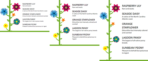
The flowers vary in their spacing along the height of the stem in order to stay aligned with the text.
Check out the finished demo again and play around with it. The block of text on the left always stays roughly the same height as the list of flowers on the right, so this is a great example of how you can make your web page flexible and still keep the design balanced at different font sizes and window sizes. Here, I’ve used a liquid width on the overall page, as on the Clearleft site, simply because that makes the difference in the spacing of the images more dramatic and easy to see for demo purposes. But you could just as easily use this effect on a fixed-width or elastic wrapper in order to keep images aligned with variable text sizes. You could also use this effect horizontally instead of vertically to fill up the entire width of a div or window with fixed-width images, giving you more leeway to make the overall width flexible.
There’s really no fancy or complicated CSS in use here, but it produces a fun effect that makes your design a lot more adaptable to the myriad of user configurations on the web.
A note about IE 6
I know that there are some problems with my demo page in IE 6ŌĆölack of support for alpha-transparent PNGs and float drop at small window sizes due to auto-expansion of divs to fit large contentŌĆöbut they’re not related to the actual effect that this tutorial sets out to teach, so I’ve chosen not to include their fixes in this tutorial. In your own pages using this effect, you may never run into these problemsŌĆöor you may run into more. But the CSS for the effect itself doesn’t require any tweaking for IE 6.


Great, easy to follow example. Thanks for sharing
Couldn’t get your demo to work in FF6 nor Chrome…?
Can you be more specific about what is happening in those browsers? Make sure you are zooming just the text, not the page, and also try resizing the browser window. You’ll see the flowers move further apart and closer together so that they always align with their names.
Waw Nice topic
Excellent solution to a very annoying web design problem. Thank You very much.
good work….
Thanks for the techniques. Your example web site seems to have changed to a different technique, but this technique is still valid, just not used there, so the text reads a bit funny! Good there is a picture of what it used to look like, even if not dynamic.