Responsive web site design and development
Provided:
- visual design
- HTML development
- CSS development
- WordPress development
- mobile optimization
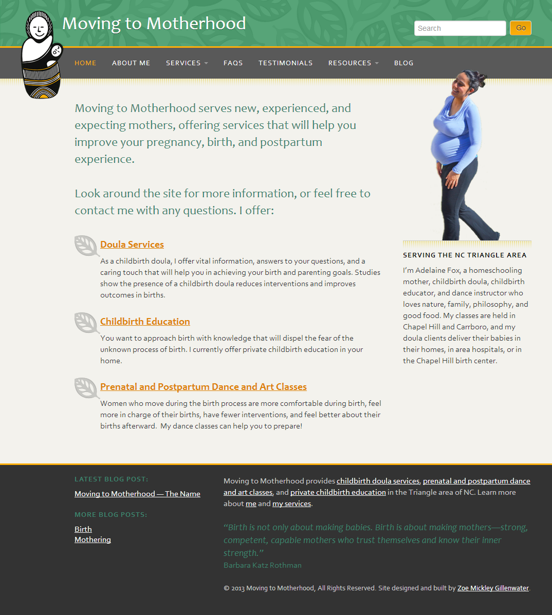 2-column layout seen at wider browser widths
Moving to Motherhood is a web site promoting the services of a local doula, Adelaine Fox. The web page is responsive, featuring a fluid/liquid layout that adjusts in width based on the userŌĆÖs window size, as well as CSS3 media queries┬Āto change the number of columns, presence of images, and other layout details at different window sizes. This responsiveness increases the usability and accessibility of the page and ensures it looks great on a range of different devices, from small mobile phones to wide-screen desktop monitors.
The site is built on WordPress as a custom theme with some Bootstrap components. I customized the WordPress admin area to make it easier for Adelaine to add and update the content across her site, not just in the blog section. I also wrote a guide for Adelaine with formatting guidelines and basic instructions on how to maintain her site.

