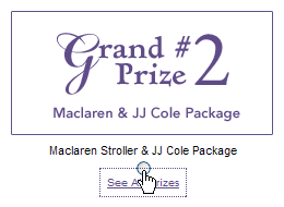
On Thursday, while I was entering the Babies R Us Mother’s Day Sweepstakes, I had to choose between two grand prize packages to win. There was a radio button for each package, as well as a link right below each radio button reading “See All Prizes.”
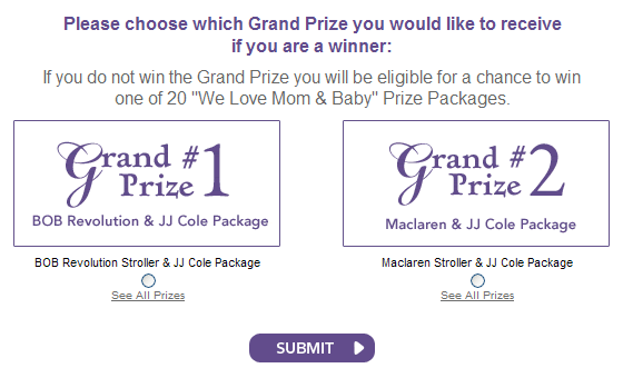
The "See All Prizes" links below each grand prize package radio button.
I was happy to see this “See All Prizes” link, since I didn’t know what the difference between the BOB Revolution Stroller and Maclaren Stroller was. So I clicked on the link and got a popup window listing the prizes in each package. But that was it. I didn’t actually get to see any of the prizes. Nor did I get a description of each item. Nor did I get links to the pages on the Babies R Us site where I could view each item and learn more about it.
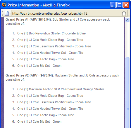
The popup listing the prizes.
I was left still not knowing what the difference between the two strollers was, and thus still didn’t know what choice I should make. Sure, I could go search for these strollers myself on the Babies R Us site. But I wish they hadn’t of gotten my hopes up by saying “See All Prizes,” when saying “See List of Prizes” would have been more accurate and left me less annoyed. (Plus, how hard would it have been to link each prize to its associated product page?)
The lesson here: language does matter. Mean what you say so your users get what they expect to from you.
Back on the form, I randomly picked the second prize packageŌĆöor at least I tried to. When I clicked on its radio button, the prize lising popup window appeared again. The clickable area of the prize link was overlapping the clickable area of the radio button. I see why they did thisŌĆöthat prize link text is dang small. Expanding its clickable area (via padding in the CSS) helped me select it without having to be terribly precise. But when it came time to actually select a radio button, it made things worse.
The clickable area of the link overlaps the radio button, so clicking in the middle of the radio button selects the link, not the button.
I closed the popup and tried clicking on the label text “Maclaren Stroller & JJ Cole Package” right above the radio button. Alas, this did nothing, because this text was not actually marked up as a label element in the HTML. Finally, I was forced to very slowly and precisely move my cursor over the top half of the radio button, where I could finally click to select it.
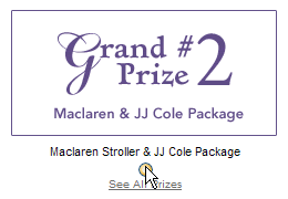
Moving your cursor to the very top of the radio button finally lets you select it instead of the link below.
Radio buttons are small enough targets to hit as it is. Reducing their clickable area by half because you’ve overlapped them with the clickable area of an adjacent link makes using them ridiculously difficult. If the label text had been marked up as an actual label, I could have just clicked on this text to select its associated radio button. This helps people with mobility impairments, but as you can see from this example, it helps people without disabilities as well when space is tight and there are lots of little competing things to click on.
The lesson here: use label elements on form fields. Always. It really does matter.