The liquid web site motherload

I feel like a kid in a candy store. A nerdy kid. Because I’ve hit the liquid web site motherload: Nomensa’s portfolio.

Nomensa is a web agency specializing in accessibility and usability. Their own site is a nice example of a liquid design, and I’ve had it bookmarked for a while, but I finally got a chance to check out the sites in their portfolio. There are dozens and dozens of them, and almost all of them are liquid. (They also have a few elastic ones, and a few fixed-width.) Unfortunately, Nomensa doesn’t provide links to all of their work, but only a select few as case studies. But, you can google the names of the non-case-study clients, and you’ll find that most of these sites are liquid as well.

Now, I grant you, many of the sites are not terribly stylish. But they still are really useful to look at to get ideas for how to handle content and layout in liquid layouts. You could easily use the same techniques they’re using with a bit more spit and polish added.
(more…)

CSS effect: space images out to match text height

I’ve been on my soapbox a lot lately, so I decided it was time to step down for a bit and do a nice, non-controversial CSS tutorial. Wouldn’t you agree?

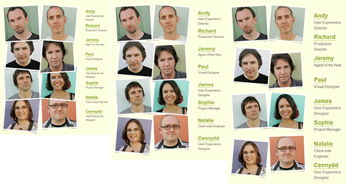
The inspiration for this tutorial came from the “Who we are” page on the Clearleft site. Try resizing the text—only the text, not the whole page—and notice how the photos move farther apart and closer together. They always stay aligned with the names they go with, and the overall height of the photo block never gets too far off the height of the block of text to the left. So, the design always appears balanced.

The images remain the same size but change their spacing as the text size changes.

The images remain the same size but change their spacing as the text size changes.

I love this effect; it’s a very clever way to fill up the entire available space with images without having to actually scale the images. It’s basically another take on what I call sliding composite images. There are an unlimited number of ways to create sliding composite images—background positioning, absolute positioning, margins, etc—but I wanted to share one way to accomplish the particular effect shown on the Clearleft site. Luckily, it’s really quite simple.
(more…)

Nicole Sullivan speaking about OOCSS at the CSS Summit

The CSS Summit on July 18 now has its final speaker: Nicole Sullivan! She’ll be speaking about Object Oriented CSS (OOCSS), a topic she first addressed at Web Directions North and which is getting a lot of praise and attention. I personally am really excited to see her presentation and learn more about OOCSS.

Registration for The CSS Summit is still just $139 for an individual and $439 for a meeting room (meaning, you can get a bunch of people together in one place and all attend the conference) through July 3. Use the code CSSZOEMG when registering to get $25 off. A percentage of the proceeds will go to the Children’s Organ Transplant Association.

Why browser zoom shouldn’t kill flexible layouts

Now that all the major browsers include the ability to zoom the entire page layout, rather than just increase text size, are liquid and elastic layouts obsolete? Can’t we just use fixed-width layouts and let the user zoom them if needed? The answer to that question depends on whether browser zoom solves all of the same problems than liquid and elastic layouts solve, and I don’t think it does.

Don’t get me wrong—it’s great that browsers have added this zoom ability. It’s yet another tool to give users more control to view web pages in a way that is most easy and enjoyable for them. But liquid and elastic layouts still offer a lot of benefits, as does plain old text resizing. Let’s go through the flexible layout benefits one by one and see if browser zooming on fixed-width layouts can deliver just as well.
(more…)

Speaking, near and far

I have a few new speaking engagements to tell you about.

First, I’m participating in the “virtual” conference called The CSS Summit on July 18. Since this conference is entirely online, everyone from across the globe can attend. There are some great speakers lined up. I’ll be giving a very similar talk as the one I did at the most recent Voices That Matter: Web Design Conference, so if you’ve downloaded those slides and now want the notes and audio to go with them, this is your chance!

Registration for The CSS Summit is just 139 bucks for an individual and 439 for a meeting room. Use the code CSSZOEMG when registering to get $25 off. A percentage of the proceeds from every Summit will go to charity, and this time around the recipient will be the Children’s Organ Transplant Association.

Much closer to home, I’m speaking at the UNC Webmasters meeting on June 4 (tomorrow!) in Chapel Hill, NC. If you’re affiliated with UNC, please stop by and introduce yourself! Again, it’s a similar presentation to the one I did at Voices That Matter, but much more informal and Q&A oriented.

Finally, I’ll be speaking at a Carolina Adobe User Group meeting later this month. I’ll have more details about that soon.

Two usability tips: mean what you say, and use form labels

On Thursday, while I was entering the Babies R Us Mother’s Day Sweepstakes, I had to choose between two grand prize packages to win. There was a radio button for each package, as well as a link right below each radio button reading “See All Prizes.”

The "See All Prizes" links below each grand prize package radio button.

The "See All Prizes" links below each grand prize package radio button.

I was happy to see this “See All Prizes” link, since I didn’t know what the difference between the BOB Revolution Stroller and Maclaren Stroller was. So I clicked on the link and got a popup window listing the prizes in each package. But that was it. I didn’t actually get to see any of the prizes. Nor did I get a description of each item. Nor did I get links to the pages on the Babies R Us site where I could view each item and learn more about it.
(more…)

Voices That Matter: Web Design Conference 2009

I just gave my talk Designing CSS Layouts for the Flexible Web here in San Francisco for the Voices That Matter: Web Design Conference. I was asked to give the same presentation I gave last year, but of course I had to do a little bit of updating and improving. So, here are the new and improved slides for your downloading pleasure:

Designing CSS Layouts for the Flexible Web (PDF, 5 mb)

Yes, it’s a big file—there are a lot of graphics in the PowerPoint. But I didn’t want to compress it very much and have all those graphics look distorted, since examining the graphics is the main point of the presentation.

If you’re ready to get beyond the graphics and start working on the actual CSS techniques alluded to in the presentation, I’ve written up many of them on this blog:

Creating sliding composite images

This tutorial is slightly adapted from Chapter 9 of my book, Flexible Web Design: Creating Liquid and Elastic Layouts with CSS. You can download most of Chapter 9 for free as a PDF at the Flexible Web Design companion site, as well as download the HTML, CSS and image files that go along with this tutorial.

Since the area available for an image to display within a flexible layout changes on the fly, your images may need to as well. While fixed-width images can work within flexible layouts—as long as they’re not too large, or you have matching minimum widths in place—there are lots of ways you can dynamically change the screen area that an image takes up.

I’ve already written about how to make images literally scale and how to use variable cropping on images. But perhaps you don’t want either end of your image dynamically cropped off—there may be important content on each side that you want to always keep in view. And perhaps you don’t want to scale the entire image, because although this would keep the entire width of the image always visible, it would also change the vertical space the image takes up, which might not work for your design. This is the perfect time to try using what I call a composite image.
(more…)

Hiding and revealing portions of images

This tutorial is slightly adapted from Chapter 9 of my book, Flexible Web Design: Creating Liquid and Elastic Layouts with CSS. You can download most of Chapter 9 for free as a PDF at the Flexible Web Design companion site, as well as download the HTML, CSS and image files that go along with this tutorial.

Since the area available for an image to display within a flexible layout changes on the fly, your images may need to as well. While fixed-width images can work within flexible layouts—as long as they’re not too large, or you have matching minimum widths in place—there are lots of ways you can dynamically change the screen area that an image takes up.

I’ve already written about how to make images literally scale, but another way to change the amount of screen area an image takes up is to dynamically change how much of the image is shown at any given time. The image itself doesn’t change in size—the amount of space in which it’s allowed to show does, and the rest of the image just remains hidden outside of that space. I call this “variable cropping.”

You can create a variable cropping effect with either background or foreground images. Both look the same, but each is specially suited to different situations.
(more…)

Foreground images that scale with the layout

This tutorial is slightly adapted from Chapter 9 of my book, Flexible Web Design: Creating Liquid and Elastic Layouts with CSS. You can download most of Chapter 9 for free as a PDF at the Flexible Web Design companion site, as well as download the HTML, CSS and image files that go along with this tutorial.

Since the area available for an image to display within a flexible layout changes on the fly, your images may need to as well. While fixed-width images can work within flexible layouts—as long as they’re not too large, or you have matching minimum widths in place—there are lots of ways you can dynamically change the screen area that an image takes up.

One way to dynamically alter the footprint of an image is to make it literally scale, based on either the text size or the changing dimensions of its parent element. Both are elegant effects that are deceptively simple to create.
(more…)

View more posts: