I’ve been on my soapbox a lot lately, so I decided it was time to step down for a bit and do a nice, non-controversial CSS tutorial. Wouldn’t you agree?
The inspiration for this tutorial came from the “Who we are” page on the Clearleft site. Try resizing the textŌĆöonly the text, not the whole pageŌĆöand notice how the photos move farther apart and closer together. They always stay aligned with the names they go with, and the overall height of the photo block never gets too far off the height of the block of text to the left. So, the design always appears balanced.
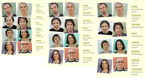
The images remain the same size but change their spacing as the text size changes.
I love this effect; it’s a very clever way to fill up the entire available space with images without having to actually scale the images. It’s basically another take on what I call sliding composite images. There are an unlimited number of ways to create sliding composite imagesŌĆöbackground positioning, absolute positioning, margins, etcŌĆöbut I wanted to share one way to accomplish the particular effect shown on the Clearleft site. Luckily, it’s really quite simple.
(more…)